“Actual results may vary” read the tiny disclaimer at the bottom of a commercial for the latest fad diet. Ain’t that the truth!
And so it goes with projecting real estate. We can make as many sophisticated models as we want, but the actual results will vary. There are just too many unknowns to make it an exact science.
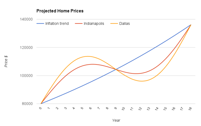
In the previous article, How to Visualize the Real Estate Cycle, I showed a rough estimate for how rental markets behave. It compared a linear market like Indianapolis to one that is more cyclical like Dallas.
The goal was to help you visualize the cyclical nature of rental home prices and how things even out in the long run.
Now let’s zoom in to examine how prices rebound after a crash. We are going to see how the rough projections stack up to reality.
Finding the Data
The hard part is finding the right data to use. Many home sales have nothing in common with the rental properties we would purchase.
There are 5 bed, 4 bath mansions with a pool, which you will find plenty of in cities like Los Angeles and Las Vegas. In turn, properties like this will make it so much easier to “sell your home in las vegas” when you want to move on, granted that you have the assistance of the best real estate company in your area. Furthermore, there are beat-up 2 bed, 1 bath homes that go through foreclosure. And there are a ton of homes in between.
Ideally we want our data to fit the exact home we would potentially purchase as a rental. For me this is in a B to A- neighborhood, roughly 35th to 50th percentile in home price for the metro area.
This exact data is tough to find, so let’s go with what we have. Zillow estimates for the middle tier homes in Dallas and Indianapolis.
Massaging the Data
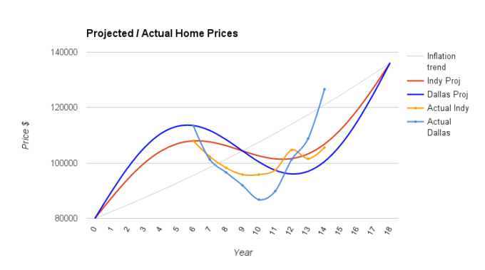
We want to match this up to our projection graph. Since the Zillow data shows January 2008 to be roughly the peak, let’s look at the January price for every year since then.
The middle tier home prices are a little too high, so we have to adjust them down. For example, Dallas peaked at $121k in the data and $113.5k in our projection. So to normalize it, we will take 94% of the Zillow numbers.
Now we are ready to add the data to our graph.
The Result

It matches up ok…
The peak to trough projections were too low – in Indianapolis there was a 12% decline with only 6% projected. The Dallas price drop was even farther off from the expected 16% – according to the data, it was a 24% drop.
The period of the cycle projection and data don’t exactly match up. In the projection, it took 6 years from the peak to the trough. In the data it only took 4 years.
Basically rather than a perfect sine graph over the whole 18 years, we have the crash and recovery effect condensed. I would expect a more gradual ascent as well.
Both markets recovered to their original peak within 8 years. This is exactly what the projection said for Indianapolis and three years ahead of schedule for Dallas!
Improvements and Caveats
There is a lot of data on Zillow and if I knew these two markets better, I might be able to find something that is closer to the rentals I would purchase. With Zillow you can narrow in on a certain neighborhood like Southwest Dallas.
Zillow estimates aren’t always accurate. I feel the numbers on Zillow are sometimes too high, especially at the peak of the market. Perhaps we could adjust those numbers down a bit to take this into account, as it has a huge affect on our peak to trough calculations.
I also don’t think Dallas is a perfect market to explore for this because it is experiencing tremendous growth. Its price recovery from the recession might not be typical of other cyclical markets because of the extra demand.
So take all of this with a grain of salt and realize it’s not perfect. But it actually matches up decently well!
Linear and Cyclical Markets
We projected that linear markets like Indianapolis, Memphis, and Kansas City will be affected by market cycles, just less than more cyclical markets like Dallas, Phoenix, and Las Vegas. The real data shows this to be true. This is why it is important to learn everything you can about real estate in your area. Articles like What You Need to Know About Las Vegas Closing Costs can help you stay informed about changing costs and the fluctuation of markets.
Investors can ignore market cycles by taking a long enough time frame. If one complete cycle is roughly 18 years, our investments over 15 or 20 years will be just about equal whether in Dallas or Indianapolis. They both match the trend line of inflation, roughly 3% a year appreciation.
But if you know you are at the bottom of the market crash, purchasing in a place like Dallas will set you up for huge appreciation in a short amount of time.
Looking at this graph, ideally you would:
- Years 1 through 6 purchase in Indianapolis
- Years 7 through 9 – notice prices are crashing and wait to purchase
- Years 10 through 12 – notice prices are rebounding and purchase in Dallas for extra appreciation
- Years 13 through 18 purchase in Indianapolis
Do you reach the same conclusion looking at the graph? Do you think it is possible to roughly time the market like this?


